The Problem:
As a musician, branding and design is a very important part of communicating your story with your fans.
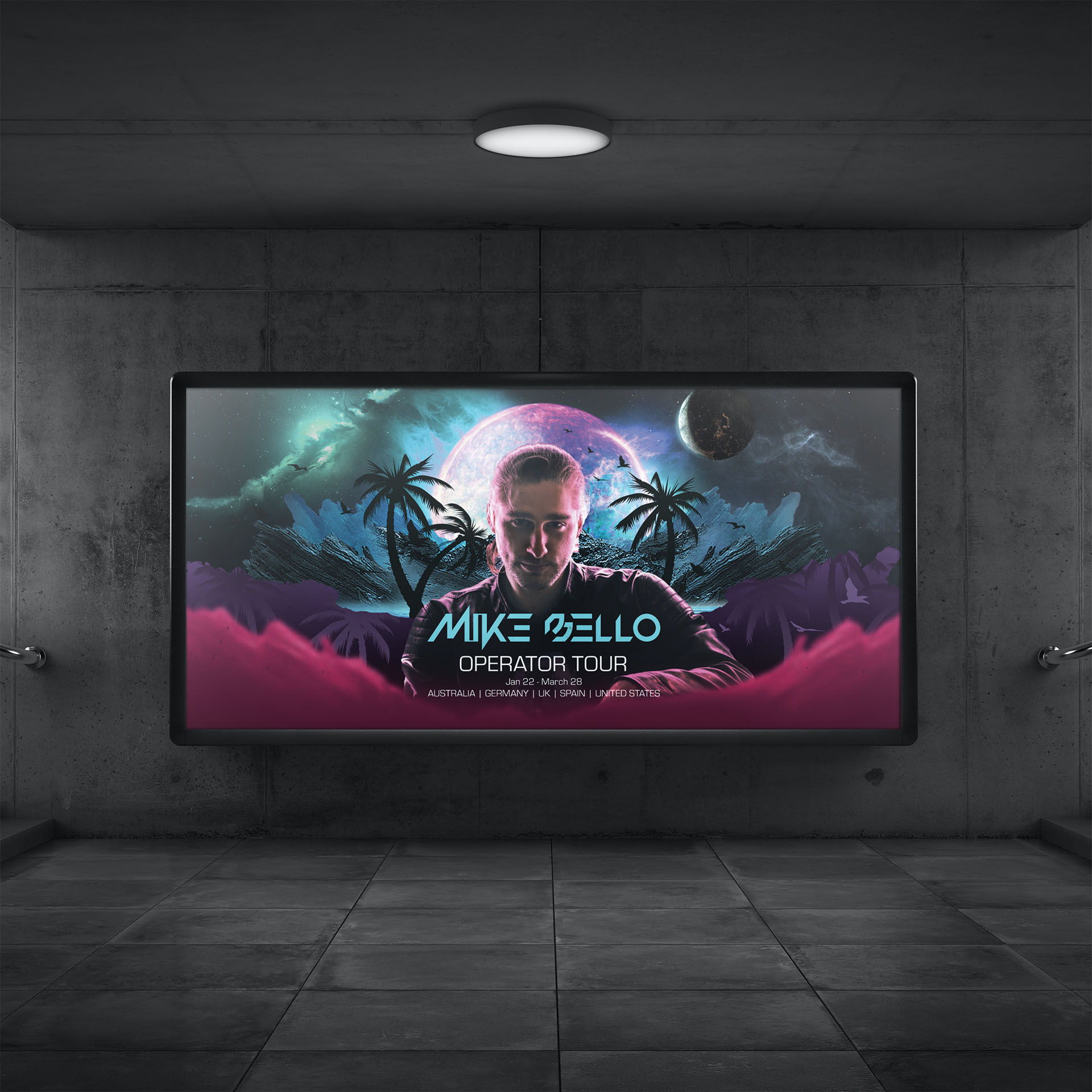
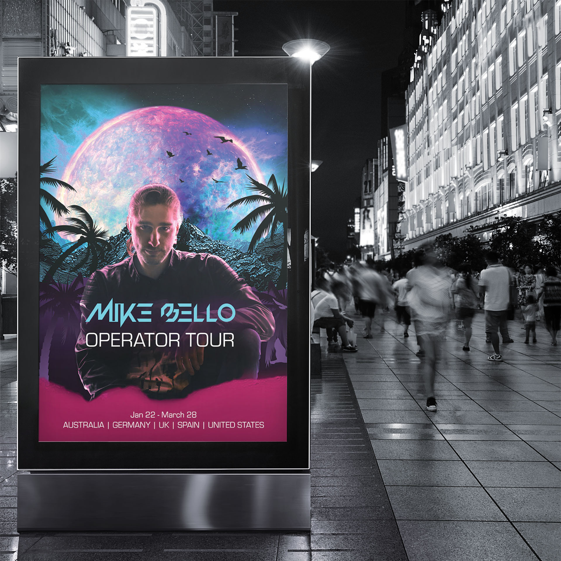
The branding for Mike Bello had a clear objective and that was to tell the story of the music through a visual medium and to have a consistent personality across every medium and social channel. This started with the logo, the music is high-energy electronic dance music suited for nightclubs and festivals and the logo needed to reflect this. The goal for the logo was to be able to give a sense of the personality and style of the music, whilst also being consistent with the overall brand message. The overall brand message is that anything is possible and there are no limits, the keyword there is limitless. This simple keyword gave me the idea to have a brand symbol that had more than one meaning, it had to be flexible and invoke deeper thought.
The Logo
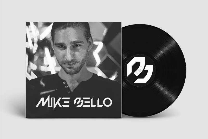
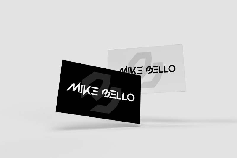
I started working on the B symbol first, before doing any work on the rest of the logo. The idea behind the B symbol is that if it is rotated 45 degrees to the left it can look like an M, and if rotated 45 degrees to the right it looks like a B. It was also purposely given a slightly obscure look to give it the feeling of being more a symbol than a letter. The rotation of the symbol gives it a slight sense of being more symbol than letter. Making the symbol look slightly less like traditional typography disconnects the identity of the symbol from the artist specifically and makes room for the symbol to identify more with the overall brand image.
The rest of the logo uses a custom designed font which is made up of many straight lines and sharp angles. This typography carries with it a sense of futurism and a clean modern look which reflects both the musical style and the brand image.
The Colours
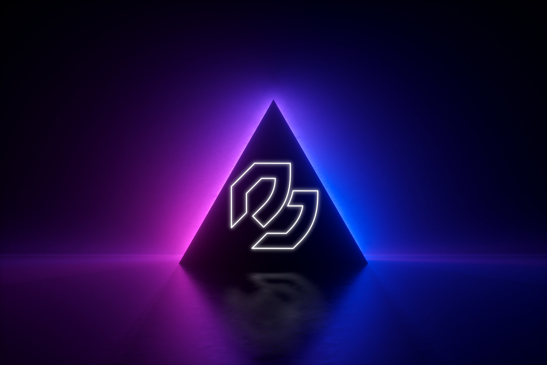
The Mike Bello brand is all about high-energy and the unlimited possibilities of the future. The message is clear; You can do anything, and anything is possible. This message is reflected in the neon-futuristic, out-of-this-world imagery, and grounded in the gritty urban tones.
The colour palette is a mix of light blue and purple-pink neon tones. These colours were chosen to support the futuristic themes and is highly reminiscent of cyberpunk art styles and fiction. Along with the futuristic themes, these colours are also strongly related to nightclubs and music festivals, which is exactly the environment for the music.
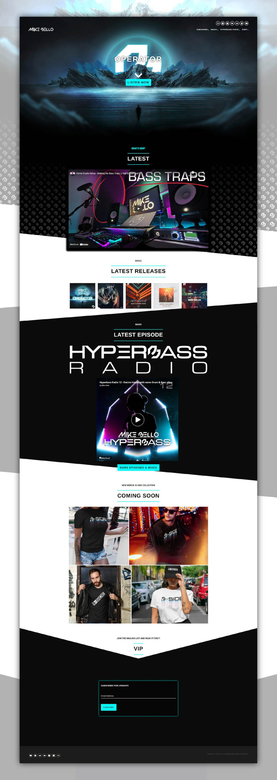
The Website
A website should be more than just a page. It’s a space that tells a story, and a home to a brands community.
The main objective of the website was to create a hub that was dynamically updated to show new content. The page opens to a large hero section with a parallax effect showcasing the latest album release. further down the site there is a section showcasing the latest YouTube content and sections for all music releases and also the latest radio show episode. Both the YouTube and Radio sections are dynamically updated to show the latest content from those channels.
The website showcases the main brand colours front and center while also carrying a modern design and feel.