Design

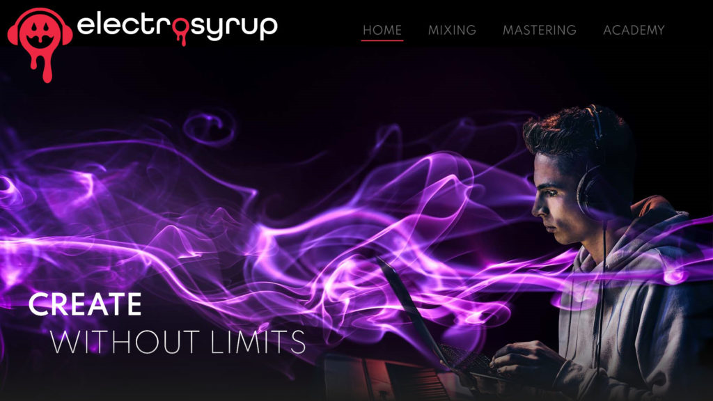
Electrosyrup Studios Web Design

The purpose of this project was to create the online storefront for Electrosyrup Studios. The website needed to represent the brand in an inviting and welcoming way, whilst also conveying the personality and energy of the studio’s brand. The goal was to create a website that conveyed three main keywords: Cutting edge, high quality, and a focus on creativity. I used the primary brand colour to create hierarchy and draw the eye to the important parts of the page, while using the secondary brand colour to create contrast. The design prioritizes a professional and high quality look whilst also conveying an aura of creativity. This aura of creativity is enhanced by the deep shade of purple, which is know to psychologically bring to mind thoughts and associations of creativity and artistic attributes. The end result is a slick and responsive web page that is easy to navigate, pleasing to look at, and also conveys the personality and story of the brand, all at the same time.

Electrosyrup Studios Web Design Read More »

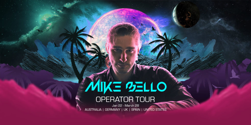
Operator Tour Art

The objective: This was a portfolio project to present my approach and take on repurposing and redesigning existing artwork and assets. To showcase this I decided to create a tour promo poster inspired by the already existing ‘Operatror’ album art. The poster needs to reference the album art whilst also having it’s own identity and encompassing a wider array of the brand colours in a way that will look vibrant in the CMYK colour space for print. The poster needs to be attention grabbing and have a bit of mystery to inspire more thought and interest in both the artwork, and by extension the artist and tour itself. The poster should look good in both horizontal and vertical billboard layouts. The Process: One of the objectives was to incorporate more of the brand colours, so I chose to make use the neon pink along with the light blue because both of these colours complement each other really well and the neon pink also comes out very vibrant on print because it falls within the CMYK colour space. I chose to add some stars, galaxies and planets to the sky in the background to enhance the mysterious and ethereal look of the artwork. I then added the large blue/pink sun in the center to sit behind the main portrait. These elements add to the ‘out of this world’ imagery that is consistent with the brand image and message and also serve as a way to bring more life and interest to the artwork. Palm trees and birds were added to the background to create the feeling of a mixed reality with both familiar and unfamiliar elements. The pink and purple layers serve both as a piece for text to be overlayed on at the bottom of the artwork and also provide contrast and depth for the other background elements. I chose to use the purple and pink colours on these layers and the top part of the sun to bring balance to the image through the positioning of these colours.

Operator Tour Art Read More »